Revisiting Fabric: DataOps Principles in the Newest Microsoft Analytics Solution
When Microsoft unveiled the Public Preview of Fabric in May, I explored how DataOps was woven into the all-encompassing analytics solution. In that article, I emphasized the enduring applicability of DataOps principles in the evolving landscape of Microsoft tools, including Fabric and Power BI. These principles are essential for anticipating and adapting to inevitable tooling changes.
Since then, Fabric has undergone significant changes and shifted to General Availability in the commercial sector. To assess the progress Microsoft has made in aligning Fabric with DataOps principles, I thought I would revisit the product through the lens of several DataOps principles: Make it Reproducible, Quality is Paramount, Monitor for Quality and Performance, Orchestrate, and Reduce Heroism. Please note that my thoughts on Fabric are only intended as constructive criticism. Additionally, some features are still in Preview and are subject to change.
Make It Reproducible
Make it reproducible: Reproducible results are required and therefore we version everything: data, low-level hardware and software configurations, and the code and configuration specific to each tool in the toolchain.
This principle emphasizes version control. As I explained in my DataOps 101 sessions, version control is the first step to making analytic projects more successful. Fabric offers two features that promote reproducibility:
1) The Power BI Desktop Project (PBIP) File
This newly introduced format moves from the traditional binary file (PBIX) to a text-based format. This transition reduces the barrier to Git adoption, eliminating concerns about binaries containing confidential data in repositories. It also reduces reliance on using the cumbersome GIT Large File Storage feature to prevent repository bloat.
The PBIP file format boosts transparency, particularly in addressing the question, “What did you change to the Power BI Report or Dataset (now Semantic Model)”? However, there is still room for improvement. PBIP cannot currently save models in the Tabular Model Definition Language (TMDL) format, a feature that would streamline processes for comparing changes. Additionally, as illustrated in Figure 1, understanding the JSON files for the report side of PBIP is like deciphering code from the Matrix (I may be dating myself here). Despite these considerations, PBIP is a fantastic feature within the Fabric and Power BI ecosystem, promoting an accessible and collaborative analytics workflow.
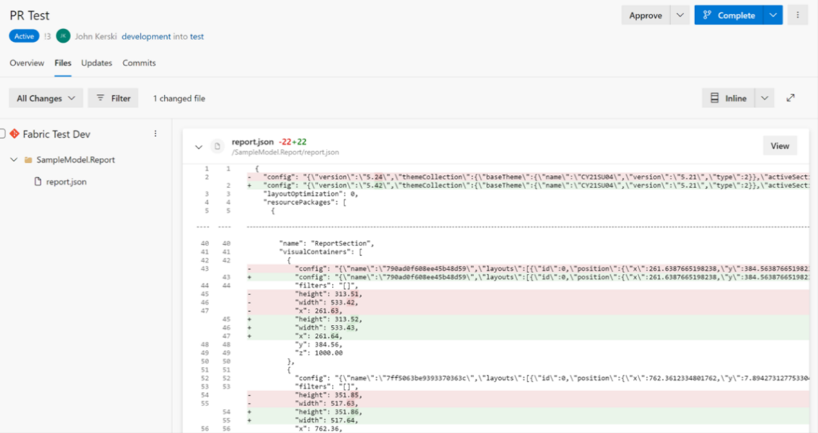
Figure 1 - Comparing changes in reports is still a challenging task.
2) Git Integration
Introducing Git Integration to Fabric workspaces lessens the learning curve for those unfamiliar with Git intricacies. Figure 2 illustrates its user-friendly interface. Git Integration has expanded to support several artifacts, including datasets, reports, and Notebooks. Hopefully, Microsoft will work toward addressing Dataflows as well. Until then, Part 33 of my series outlines the options for managing Gen1 dataflows.
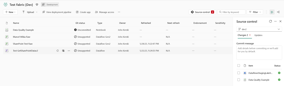
Figure 2 - Git Integration provides an easier interface for saving changes to version control.
3) OneDrive Integration with Power BI Desktop
I did say there were two profound features for managing version control, but it’s also worth acknowledging that Fabric integrates Power BI Desktop files with OneDrive. This integration is especially beneficial for smaller teams or those without access to Azure DevOps. OneDrive’s version control feature enables rollbacks to previous timestamps, providing a “better than nothing” option and layer of quality assurance.
The recent changes to the Power BI Desktop, illustrated in Figure 3, and the syncing options for Power BI reports and semantic models indicate a step in the right direction. However, I will say that the syncing option still occasionally poses challenges for my team. Issues typically arise when the dataset sync doesn’t occur automatically, or when a report suddenly stops syncing and there is no option to resync without creating a new file. This error typically results in broken URLs. I hope Microsoft eliminates both inconveniences soon.

Figure 3 - The latest version of Power BI Desktop offers an upgraded OneDrive integration.
Quality is Paramount
Analytic pipelines should be built with a foundation capable of automated detection of abnormalities and security issues in code, configuration, and data, and should provide continuous feedback to operators for error avoidance.
Test, test, and test. This principle emphasizes the importance of implementing testing regimes for semantic models, reports, dataflows, and other artifacts in Fabric. Questions regarding the correctness of columns’ formats (e.g., string, integer), their alignment with Regex expressions (e.g., email addresses, phone numbers), and the expected number of rows (e.g., a date dimension containing today’s date) should all undergo automated checks. This robust testing serves as a safety net, mitigating the risk of introducing errors into the production environment.
At the time of writing, there isn’t a feature native in Power BI or Fabric designed for instilling testing. As a result, many users resort to developing bespoke solutions, including Flávio Meneses and my own attempt. That said, Microsoft does provide the foundational elements for building repeatable testing frameworks, including:
1) The Notebook Testing Framework
Introducing Notebooks to the Fabric toolbox brings Python and its extensive library support into the testing realm for data pipelines. For example, Great Expectations (one of my favorites), has incorporated new functions tailored to support Fabric integration. The new Sempy Python library also adds flexibility to test datasets and semantic models. Leveraging these capabilities, I’ve been exploring a concept, illustrated in Figure 4, to support a native testing framework within Fabric.
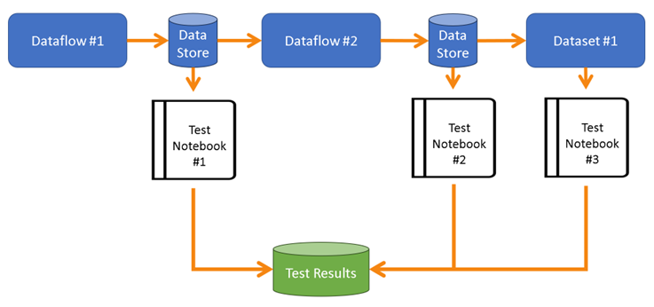
Figure 4 - Using Notebooks can establish a testing framework for data pipelines.
Notebooks function as the conduit for testing the outputs of each stage of a data pipeline, and they offer the capability to save the test results in storage. Figure 5 provides an example of what I currently use to test my custom Power Query functions designed for retrieving SharePoint data.
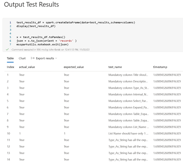
Figure 5 - With Notebooks, we can test the results of data pipeline execution.
2) Data Quality Framework
One significant risk to any analytics project is compromised data quality. While we don’t always have control over the quality of upstream data in source systems, we do bear the brunt of blame when it doesn’t look right in the reports. Consequently, it’s imperative to not only test the quality of the code we develop but to scrutinize the quality of the data itself and promptly alert stakeholders of any issues.
Figure 6 illustrates a concept I’ve been implementing in some of my projects. The outputs of each transformation (in this example, a dataflow) generate data and Data Quality Checks. For example, I may want to output rows from an upstream source with invalid column values crucial to downstream reports. These quality checks are then combined to create the foundation for a Data Quality dataset, which can produce a Data Quality dashboard. This approach maintains data quality while facilitating transparency and awareness among stakeholders.
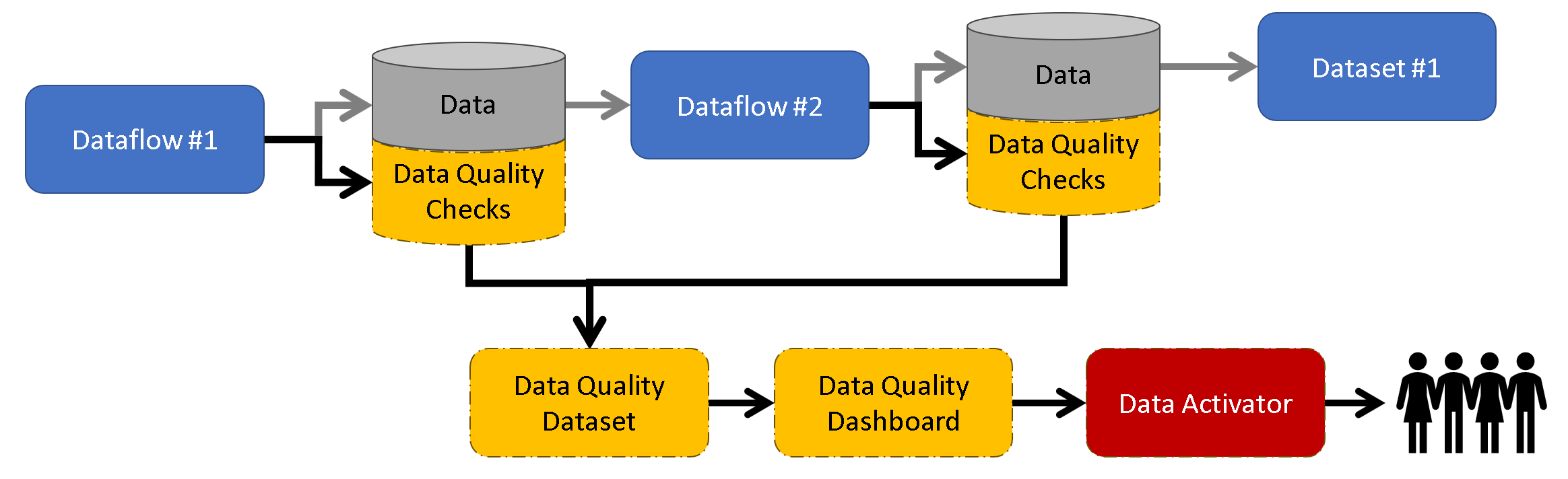
Figure 6 - Data Quality Framework with Data Activator concept.
3) DAX Query View Testing
The November release of Power BI Desktop introduced the DAX Query View, which enables the pairing of DAX queries with datasets and semantic models. Saving DAX queries with the PBIP format stores them under a subfolder labeled DAXQueries (illustrated in Figure 7).
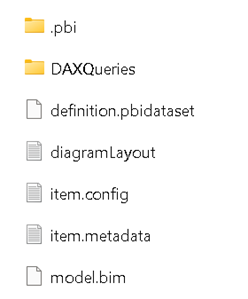
Figure 7 - Save DAX-based tests with semantic models using DAX Query View.
This capability allows us to build DAX-based tests (illustrated in Figure 8), a practice I have advocated for since Part 4 of my series. It also supports version control of our DAX-based tests.
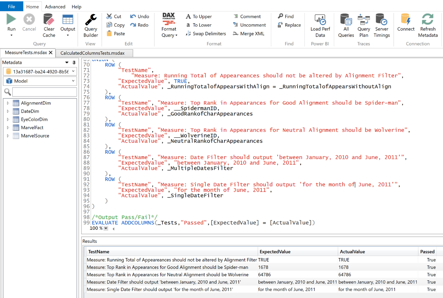
Figure 8 - An example of a DAX-based test and the output.
With so many options for testing, the question is no longer whether it’s possible to test data pipelines but how to test them. The consultant’s answer will be, “It’s depends,” but deciding not to test is no longer a viable choice (well done, Microsoft). I’ll expand on the testing in Fabric in future blog articles.
Monitor for Quality and Performance
Our goal is to have performance, security, and quality measures that are monitored continuously to detect unexpected variations and generate operational statistics.
This principle underscores the importance of treating data pipelines as a manufacturing line, emphasizing the need to check the status at every step in the process to catch errors before they reach the customer. While we’ve historically relied on closely monitoring emails for failures or using an external solution, Microsoft is moving closer to providing out-of-the-box monitoring with the following features.
1) Monitoring Hub
A centralized station, the Monitoring Hub enables viewing and tracking activities across various products. For new Fabric artifacts such as Notebooks, it provides granular information on the health and operation specifics. However, the information is still quite high-level for datasets and dataflows. I’m hopeful for future enhancements, including the ability to create custom issues based on conditions.
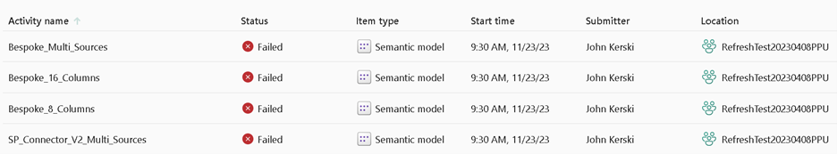
Figure 9 - The Monitoring Hub is a good start for reviewing the health of data pipelines.
Additionally, I think the Monitoring Hub should allow workspace administrators to see common issues that arise, such as:
Datasets and Dataflows with disabled schedules
Datasets and Dataflows with conflicting schedules
Apps with pending access requests
Datasets and Dataflows with invalidated credentials
Inactive accounts for users who have not visited an app or workspace in 30 days
Currently in Public Preview, this feature enables the creation of triggers based on data from a Power BI visual or Event Stream. To effectively monitor quality and performance from a Power BI perspective, it’s essential to build a Data Quality Dashboard (similar to the one I offered in the previous section) and incorporate visuals that depict that quality. This approach adopts a low-code methodology, and I’m optimistic that it will empower individuals to conduct data quality and performance testing. However, it’s crucial to plan for Data Activator and architect a custom dashboard to support comprehensive monitoring.
Orchestrate
The beginning-to-end orchestration of data, tools, code, environments, and the analytic team’s work is a key driver of analytic success.
Automating orchestration through Continuous Integration and Continuous Deployment (CI/CD) is essential for delivering analytics to customers swiftly while mitigating the risks of errors. Microsoft lays the foundation for foundation for orchestration with the following features:
1) Git Integration to Azure DevOps
Git integration with Azure DevOps enables seamless pipeline kickoffs, inspiring innovative ideas and the development of third-party tools to further enhance this experience.
2) Deployment Pipelines
Deployment Pipelines enable teams to reduce the overhead of the promotion process, decreasing cycle times. Auto-binding and deployment rules mitigate the risk of missing promotion steps that cause errors and needless support calls (i.e., data is pointing to test, and your customer notices).
As most Fabric artifacts (with a few exceptions) can now be promoted, there is a growing need to address the lack of visibility to deployment rules for non-artifact owners, I hope to see Microsoft offer an API endpoint to view all the deployment rules and help manage the parameterization of our orchestration efforts, a critical concept in DataOps.
I would also like to see Microsoft transform deployment rules into a standalone artifact integrated with Git to support the concept of Infrastructure as code (IaC), which avoids manual configuration to enforce consistency. For medium-to-large Fabric implementations, the number of rules to manage and review quickly becomes unwieldy. Furthermore, a lack of awareness about differences, such as a lack of a rule defined in production between workspaces, poses a significant risk. Introducing deployment rules as a standalone artifact integrated with Git would go a long way in mitigating these risks and providing a more streamlined process for rule management.
3) Fabric API
Similar to what Power BI REST APIs offered for orchestration, the pending Fabric [API endpoints] should provide extended orchestration capabilities in Azure pipelines. As Microsoft has been continuously releasing new endpoints, I’m waiting (impatiently) to see what Microsoft will offer in the coming months. One area of improvement is the lack of API capabilities for Apps. These capabilities, including the ability to publish an App via the API, are crucial to fully orchestrate the promotion process. Microsoft should consider providing API endpoints for any feature in General Availability, embracing the DataOps concept of Orchestration.
Reduce Heroism
As the pace and breadth of the need for analytic insights ever increase, we believe analytic teams should strive to reduce heroism and create sustainable and scalable data analytic teams and processes.
In my own words, this means avoiding burnout for you and your team. The litany of changes coming with Microsoft Fabric and Power BI can be overwhelming, but you don’t need to know everything all at once—don’t be the hero. Fabric just went Generally Available to Commercial customers and for customers in the Government Community Cloud (GCC) area is unavailable at the time of writing. If you haven’t taken advantage of it in the commercial sector, Fabric has a free trial feature for prototyping and experimentation.
If you lead a data analytics team, my advice is to invest time in learning the fundamentals of Microsoft Fabric through free Microsoft training. Also, make sure to bookmark Sandeep Pawar’s blog and Kevin Chant’s blog, as both describe the Fabric ecosystem in-depth. Be sure to empower team members to experiment with certain features, share findings, and discuss ways to enhance productivity. For guidance on determining which features to investigate, review Kurt Buhler’s beautiful infographic.
As Fabric evolves, these are exciting times for embracing DataOps and implementing its proven principles. I’d like to hear your thoughts, so please let me know what you think on LinkedIn or Twitter.
This article was edited by my colleague and senior technical writer, Kiley Williams Garrett.